What’s your website out there to do – look pretty, or generate bookings?
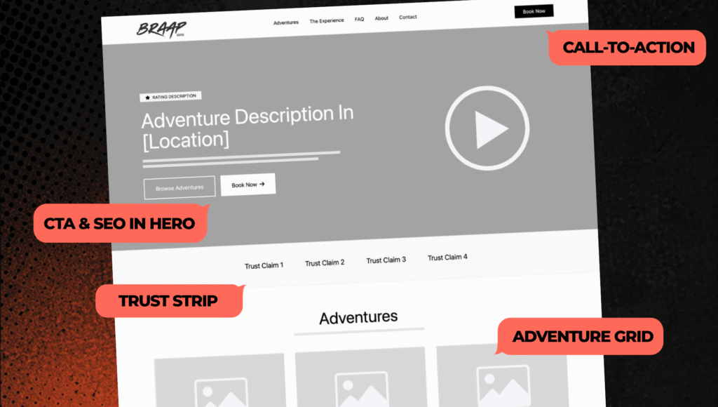
A high-converting website homepage isn’t just there to look good or “represent the brand.” Its job is simple. Take someone who’s interested and move them, step by step, toward booking a ride.
When that structure is dialed in, things start to click. More bookings, fewer questions, less friction.
Let’s walk through what that actually looks like.
Above The Fold: Capture Attention + Give Direction Immediately
When someone lands on your site, they’re making a decision fast. Stay, scroll, or bounce.
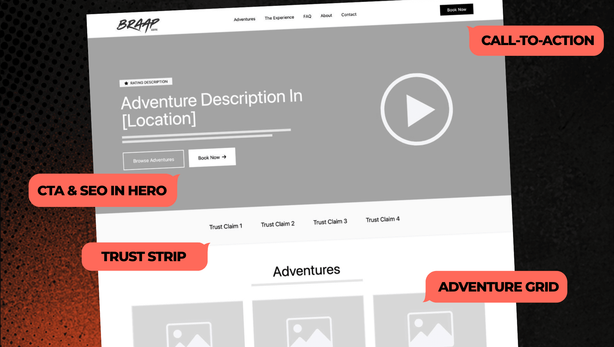
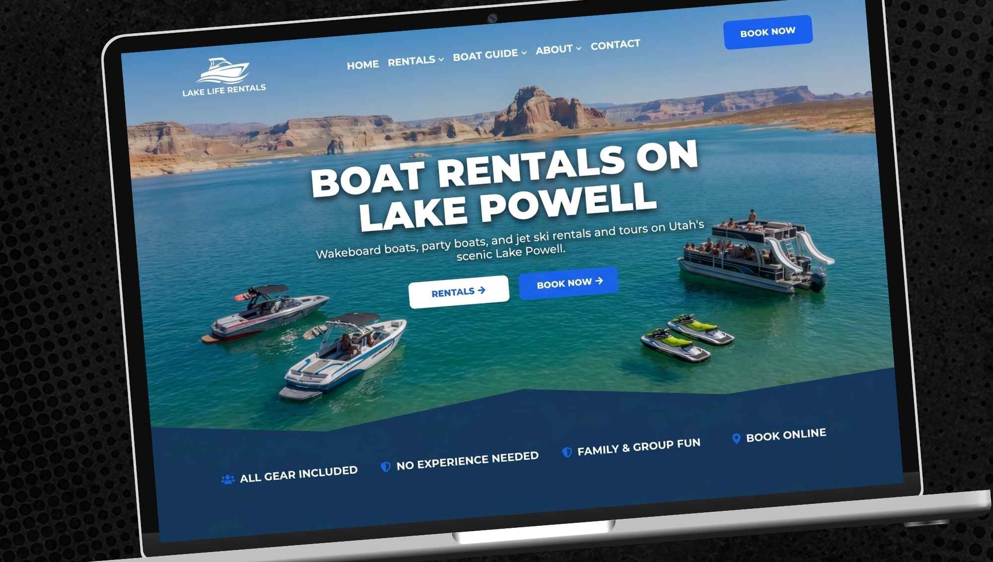
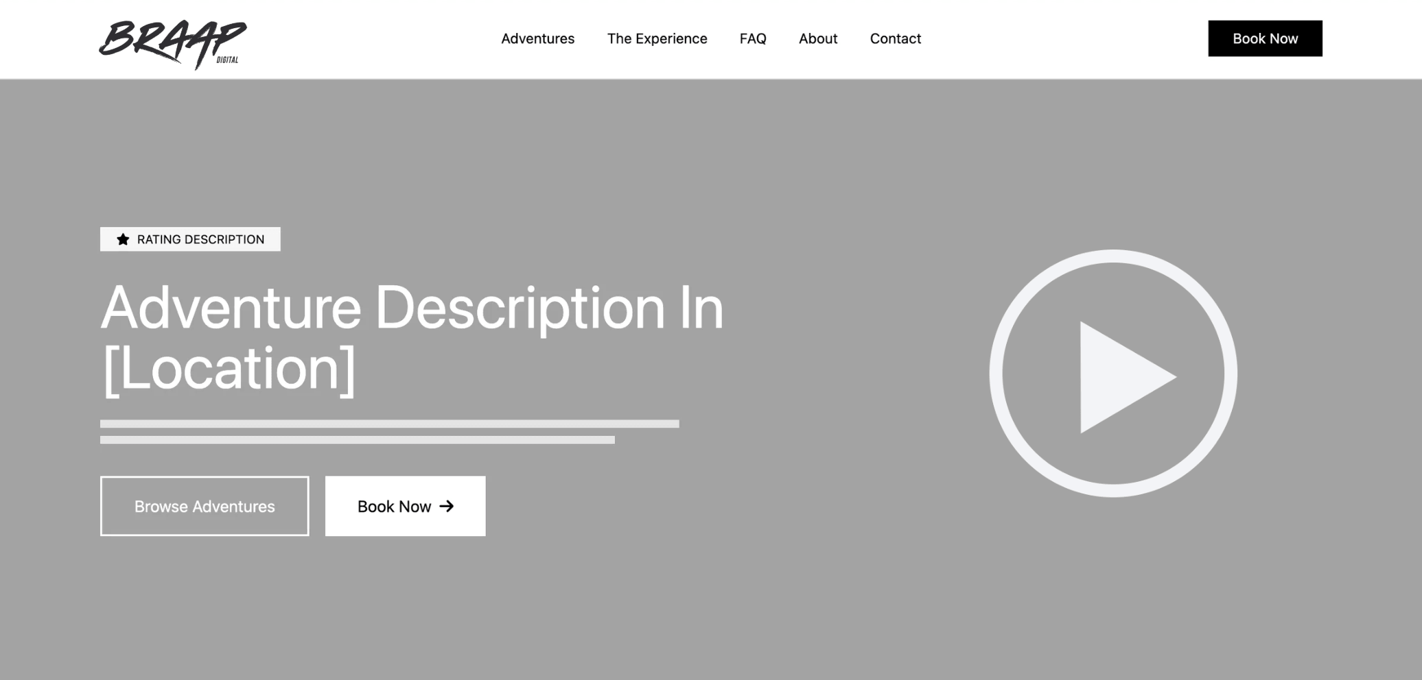
This first section has to do a lot in a short amount of time. It should be instantly clear what you offer, where you are, and what the next step is. A strong headline, a real action photo or short video (preferred), and a clear call to action go a long way here.
“Book Now” should be obvious, not something they have to hunt for. Same with a “Browse Adventures” option for people who want to look around first. Some people are ready to book right away. Others need a few seconds. You’re covering both.
Your hero image or video is what pulls people in. This is not the place for average content. Your best creative goes here. Real riders, real terrain, real energy. Something that makes someone stop and think, “That looks like a blast.” If it doesn’t grab attention immediately, it’s not doing its job.
The headline matters just as much. Your headline should clearly say what you do and where you do it. Something like “ATV Tours in [Location]” or “Jet Ski Rentals on [Lake Name].” This isn’t just for visitors, it’s for search engines too. A clear, location-based headline helps you show up when people are searching for exactly what you offer.
Your main call to action should always live in your header so it’s visible no matter where someone is on the site. Some visitors are ready to book immediately, while others decide after scrolling, and a persistent header CTA makes it easy to act the moment they’re ready without having to hunt for the next step.
Build Trust Early So People Keep Scrolling

Right after that first impression, people start asking themselves a few quiet questions.
Who is this for?
Is this safe?
Is this legit?
Is this something I can actually do?
You don’t need a long explanation. A short strip with simple trust points handles it.
Things like safety, equipment quality, years in business, and experience level support go a long way. It shows that you’ve thought about the ride from their perspective, not just yours.
When that doubt is removed early, people keep moving forward.
Let Them Find Their Ride Quickly
Once someone feels excited about the possible adventure in front of them, they want to know what they can actually book.
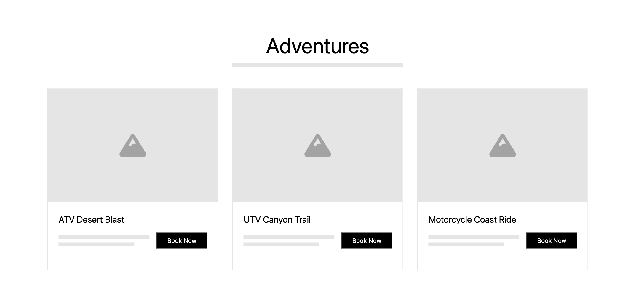
This is where your Adventures section comes in. It should be clean and easy to scan. A few strong options, clear naming, and direct booking buttons.
The photos matter here more than anything. This is where you show what the experience actually feels like. Speed, terrain, energy. The kind of shots that make someone picture themselves in it.
Visitors will see the adventure titles after the glance at the photo, so make sure they are titled to make sense at a quick glance.
If it feels exciting, they’ll keep click into an adventure or keep scrolling down the homepage. If it feels flat, they’ll start to think about looking elsewhere.
Show Them What the Experience Feels Like
At this point, people are interested. Now they’re trying to picture the day.
What does it actually feel like to do this? Is it going to be difficult? Is it going to be safe?
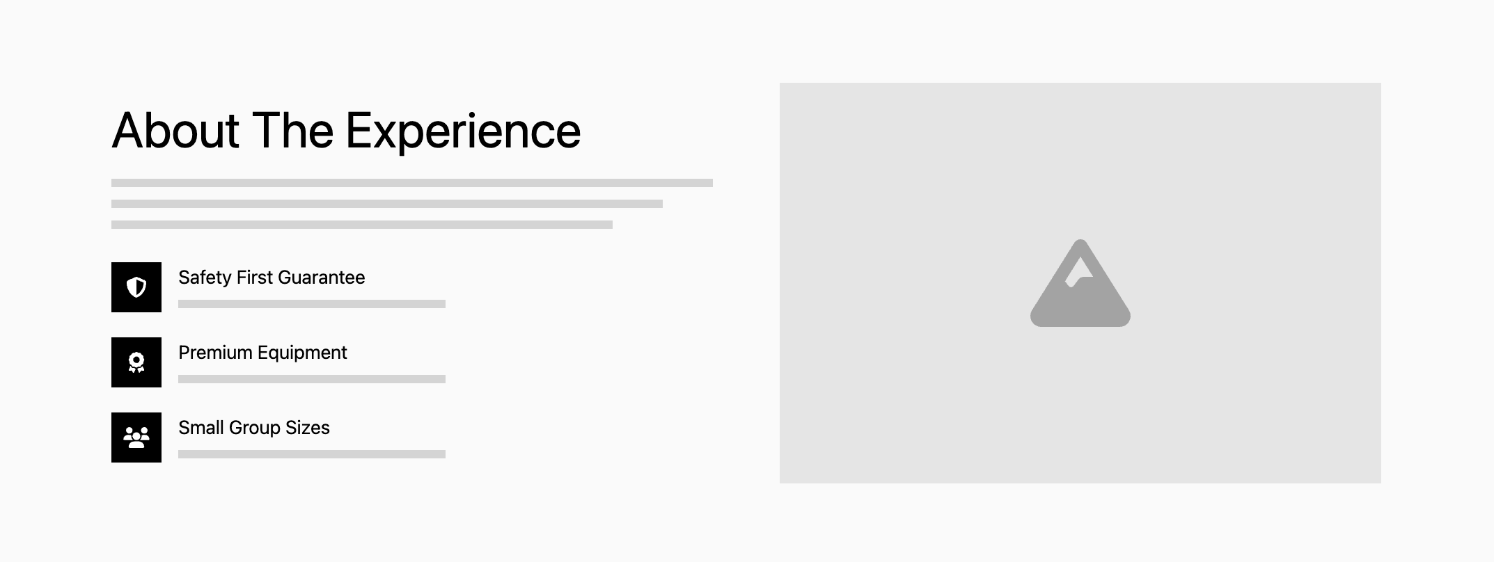
This section is less about machines and more about the experience. Who it’s for, what the ride is like, and why it stands out.
A few supporting points about safety, equipment, and accessibility help reinforce it, but the focus is still on the ride itself.
This is where interest turns into intent.
Use Photos and Video to Build Stoke and Remove Uncertainty
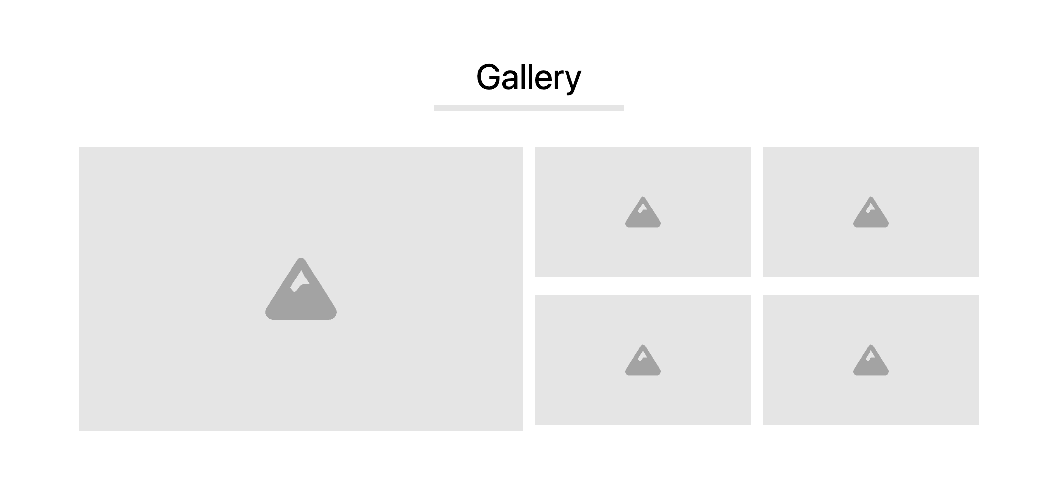
Even with a good description, people still want to see it for themselves. That’s where your gallery comes in.
Real riders, real terrain, real moments. Not staged, not generic – NEVER use stock photos. Just give an honest, exciting look at what they’re signing up for.
If you have video, this is the place to use it. A short clip does more than a dozen photos when it comes to helping someone understand what to expect.
The clearer the picture, the easier the decision.
Make It Feel Simple
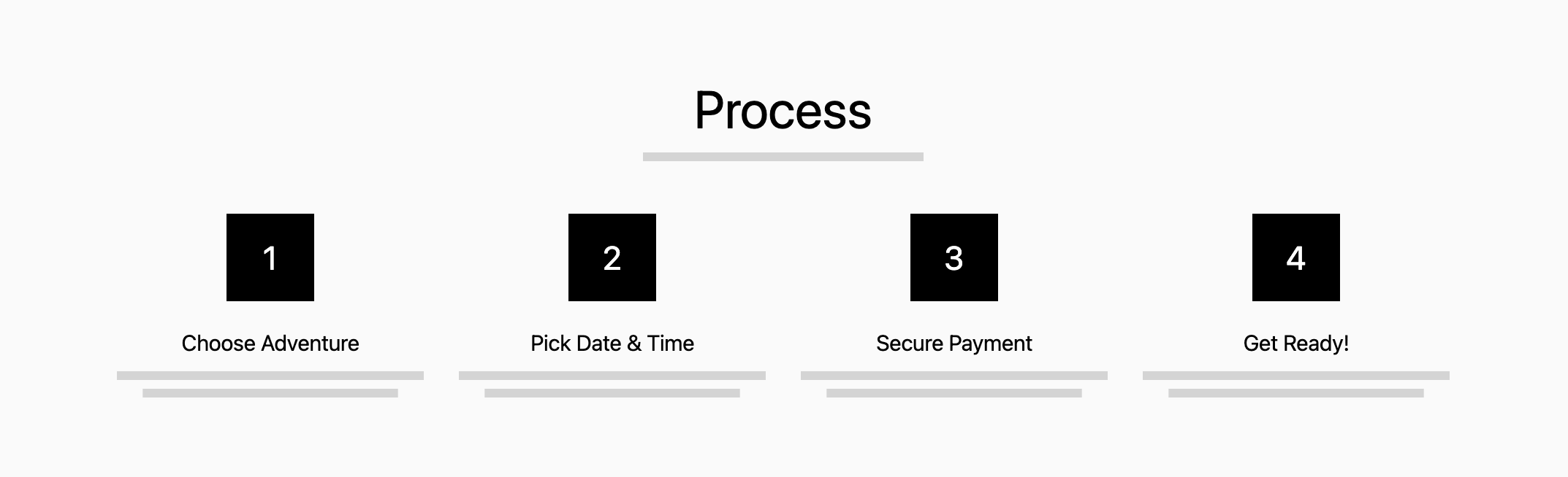
One of the easiest ways to lose a booking is to make the process, or even the experience, feel complicated. So show them how simple it is.
A short “how it works” section goes a long way. Choose your ride, pick a time, secure your spot, show up ready to go.
It also answers questions they haven’t asked yet. What happens after I book? What do I need to do? Am I missing anything? What will it be like when I arrive? How will I learn to operate the machine?
When people understand the process, they’re far more likely to follow through.
Let Other Riders Do the Talking
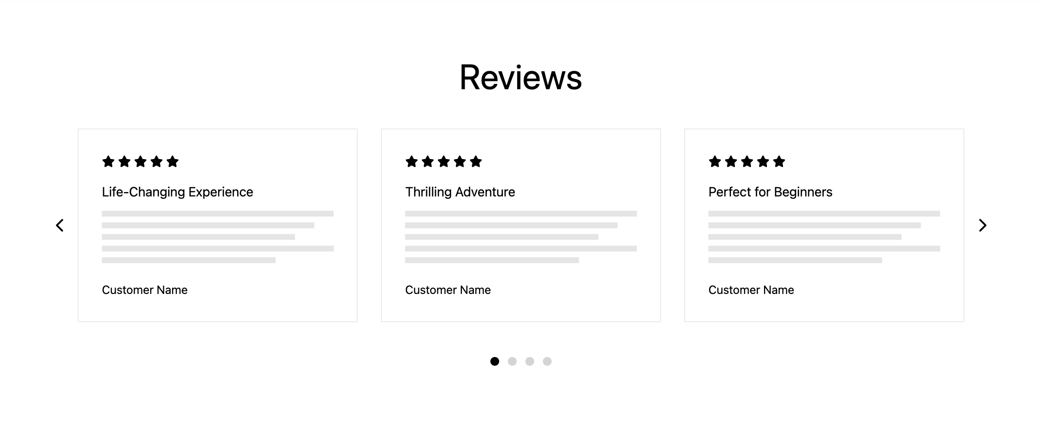
Reviews are where hesitation disappears. People trust what their peers will say more than they would trust hearing it directly from the business.
At this stage, people are looking for confirmation. They want to know others had a good experience, that it was worth it, that it’s something they can trust. They want to see if they can glean any extra information from their peers.
Short, strong testimonials with clear ratings do the job. Make sure the names of viewers are visible. Bonus points for adding a small logo from where those reviews are being pulled from (Google, TripAdvisor, etc).
It’s even better when your reviews are pulled in directly so the newest ones are always showing first. That keeps the site (and your business) feeling active and relevant without any extra effort.
Answer the Last Few Questions
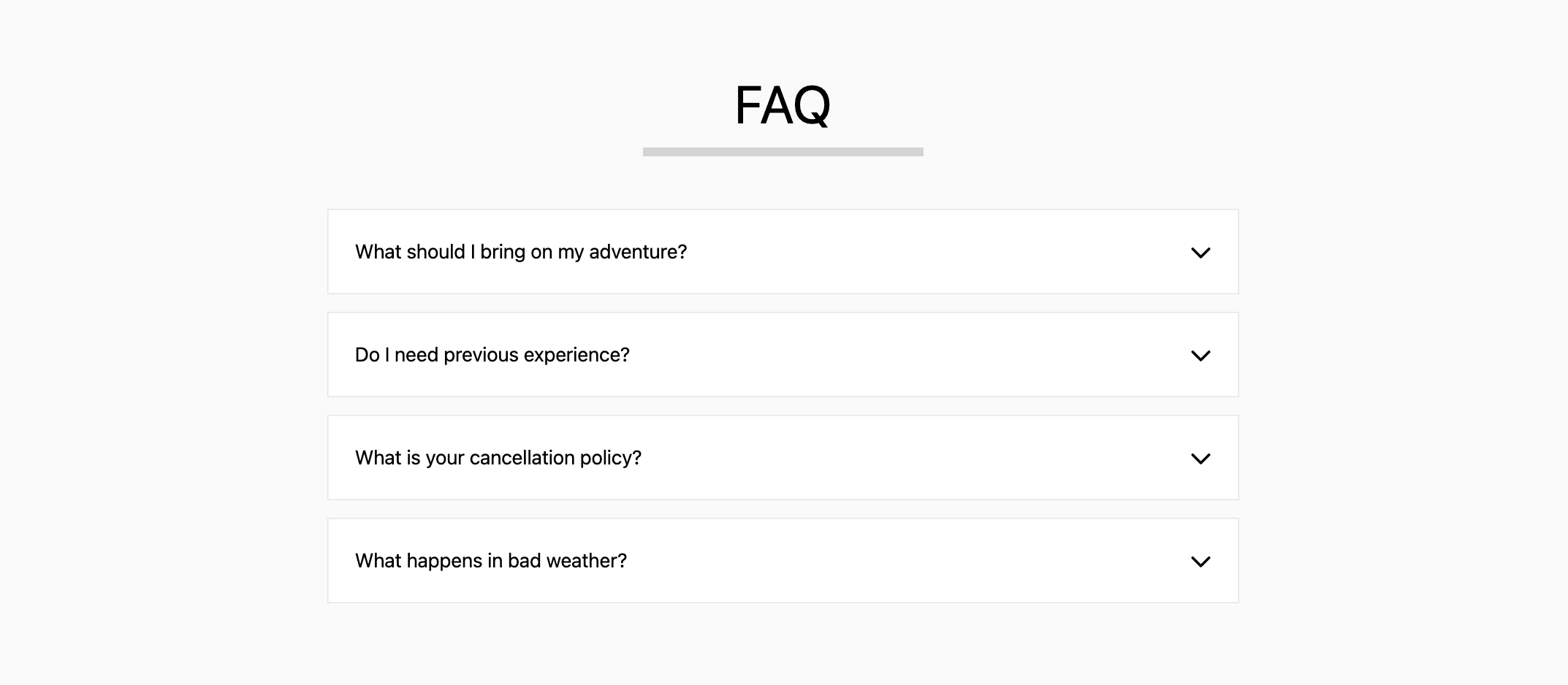
Before someone books, there are always a few final questions.
What should I bring?
Do I need experience?
What happens if the weather turns?
Answer them right on the page.
This section isn’t just helpful. It keeps people from leaving your site to find answers somewhere else.
Show Them Where You Are (and Help Google Too)
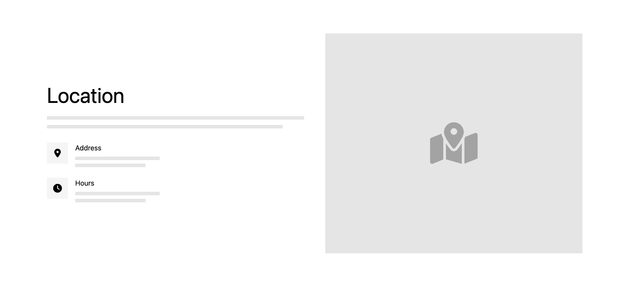
What’s the famous saying, “Location Location Location”? This is a section that gets missed on many outfitter websites, but it matters more than you’d think.
Visitors want to know exactly where you’re based and how it works logistically. Google wants that information too.
Clear location details, hours, and a simple visual go a long way here. It builds confidence for the customer and helps with search visibility at the same time.
Build Your Tribe (and Turn “Maybes” Into Bookings)
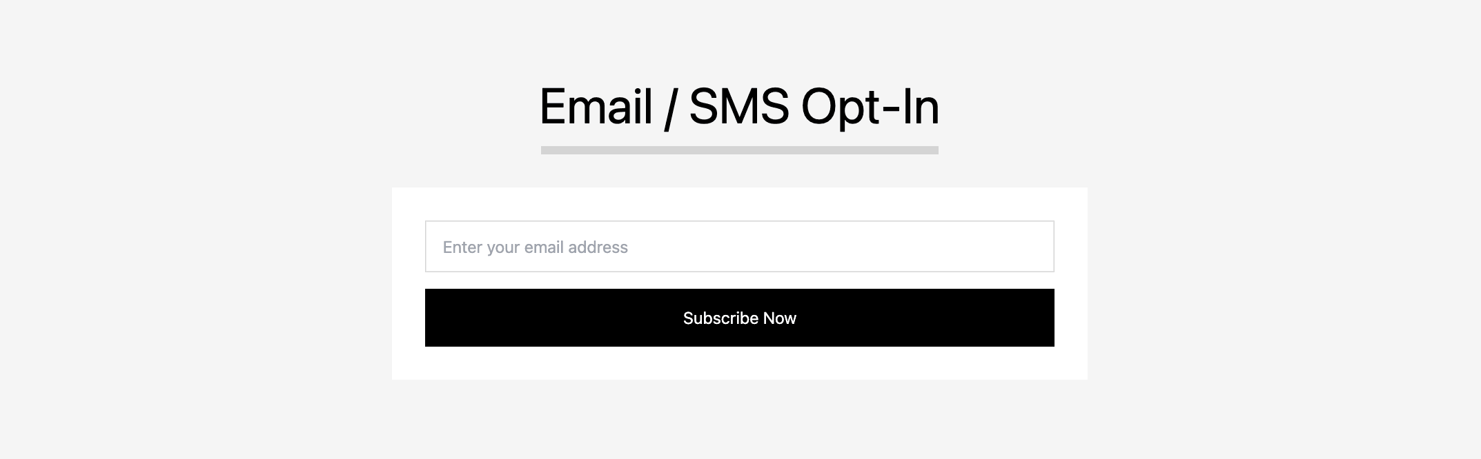
When you capture an email address, you now have a direct line to stay in front of them. Over time, this becomes one of your most reliable booking channels, especially for repeat riders.
SMS takes that one step further. Open rates on email can sit around 5–20%, while texts are seen by closer to 95% of recipients. This is where you can run a simple deal club, send out last-minute availability, or let people know when conditions are perfect. It’s direct, immediate, and incredibly effective when used right.
This is also where you can give someone a small push to take action. Think like an e-commerce brand. Offer a simple incentive for signing up. A small discount, a free add-on, or early access to prime booking slots. It doesn’t have to be huge, just enough to tip someone from “maybe later” to “let’s book this.”
Not everyone converts right away. But if you bring them into your world and give them a reason to come back, a lot more of them will.
Over time, this becomes more than a list. It becomes your group of repeat riders, referrals, and loyal customers. This is how you build and reward your tribe.
Finish Strong With a Clean Footer
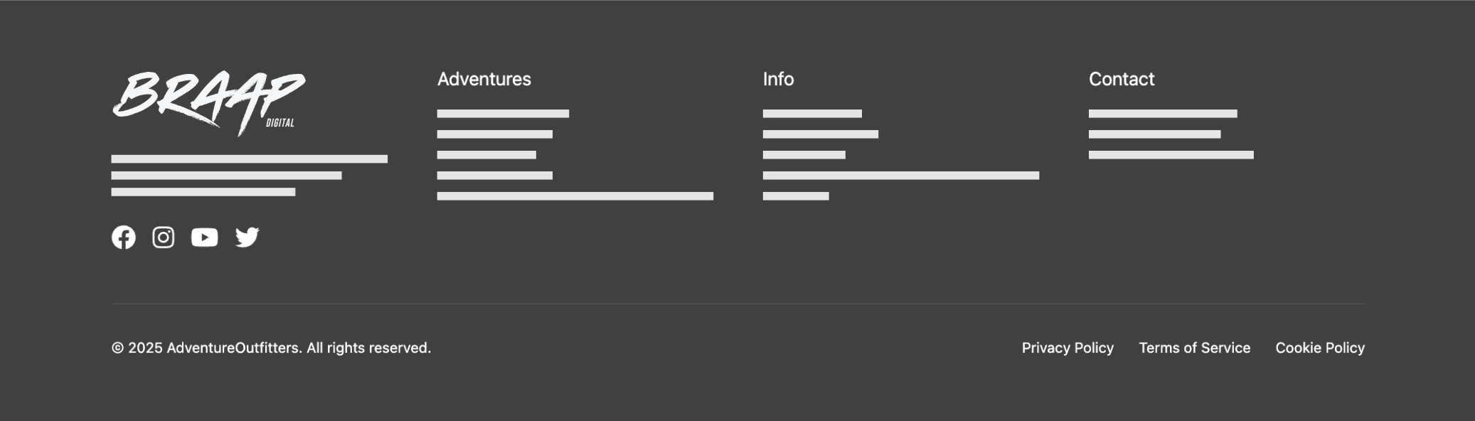
The footer isn’t where people convert, but it’s where they go when they’re double-checking or they’ve hit the bottom of the scroll and are looking for their next step.
Clear navigation, contact info, social links, and basic policies all help reinforce that this is a real, established operation.
It doesn’t need to be fancy. It just needs to feel complete.
How It All Works Together
None of these sections are random. Each one removes a different layer of friction.
The top of the page creates direction. The middle builds confidence. The lower sections remove hesitation and answer final questions.
By the time someone reaches the bottom, there shouldn’t be anything left to figure out.
They know what it is. They know what it’s like. They know how it works.
At that point, the decision becomes simple.
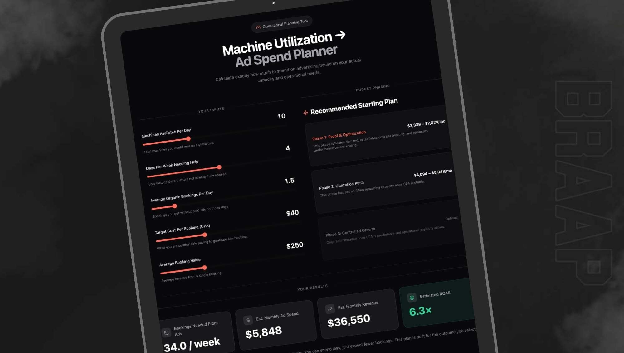
Marketing works best when it removes friction and fills empty machines. Your website is the first place that should happen.
If You Want a Site That Actually Gets Bookings
When your homepage is structured the right way, it does that work for you. It answers questions, builds confidence, and moves people toward booking without needing extra effort.
That’s the difference between a site that sits there and one that fills your calendar.
If your current site isn’t producing the bookings it should, it’s usually not a traffic problem. It just needs to be built to convert.
We build websites specifically for powersports rental and tour operators. Everything is designed around conversion, not just design trends – although our websites do look good and are built to create excitement centered around the experience and adventure.
If you want a website that actually helps fill your seats, check out BRAAP Sites.