If you’ve ever looked at your website traffic and thought, “We’re getting visitors… so why isn’t the calendar fuller?” you’re probably not wrong.
In a lot of cases, the issue isn’t traffic. It’s what happens after someone lands on your site.
People don’t spend much time thinking this through. They open a few options, compare quickly, and make a decision. When booking feels simple, they move forward. When something slows them down, they move on.
A website that gets traffic is not the same as a website that gets bookings.
If you don’t have an online booking system yet, stop right now.
Stop reading this, head over to Google and research online booking systems (or reach out – we have a few we prefer). Online, immediate booking really is a necessity if your goal is more bookings.
Think about how people actually plan things.
It’s usually at night. After dinner. On the couch. Someone pulls out their phone and searches “ATV rental near me.” They click a few websites and compare options.
If your site requires them to call in the morning to check availability, the momentum is gone. If another shop lets them see open time slots and reserve immediately, that’s where the booking happens.
If your site requires people to call, email, or wait for a response, you are losing business. Not occasionally, but consistently.
An online booking system with a real booking element or widget on your site is not optional. It is the baseline.
Your site should guide people to book, not make them hunt
A lot of outfitter sites are built to explain the business instead of move someone into a reservation.
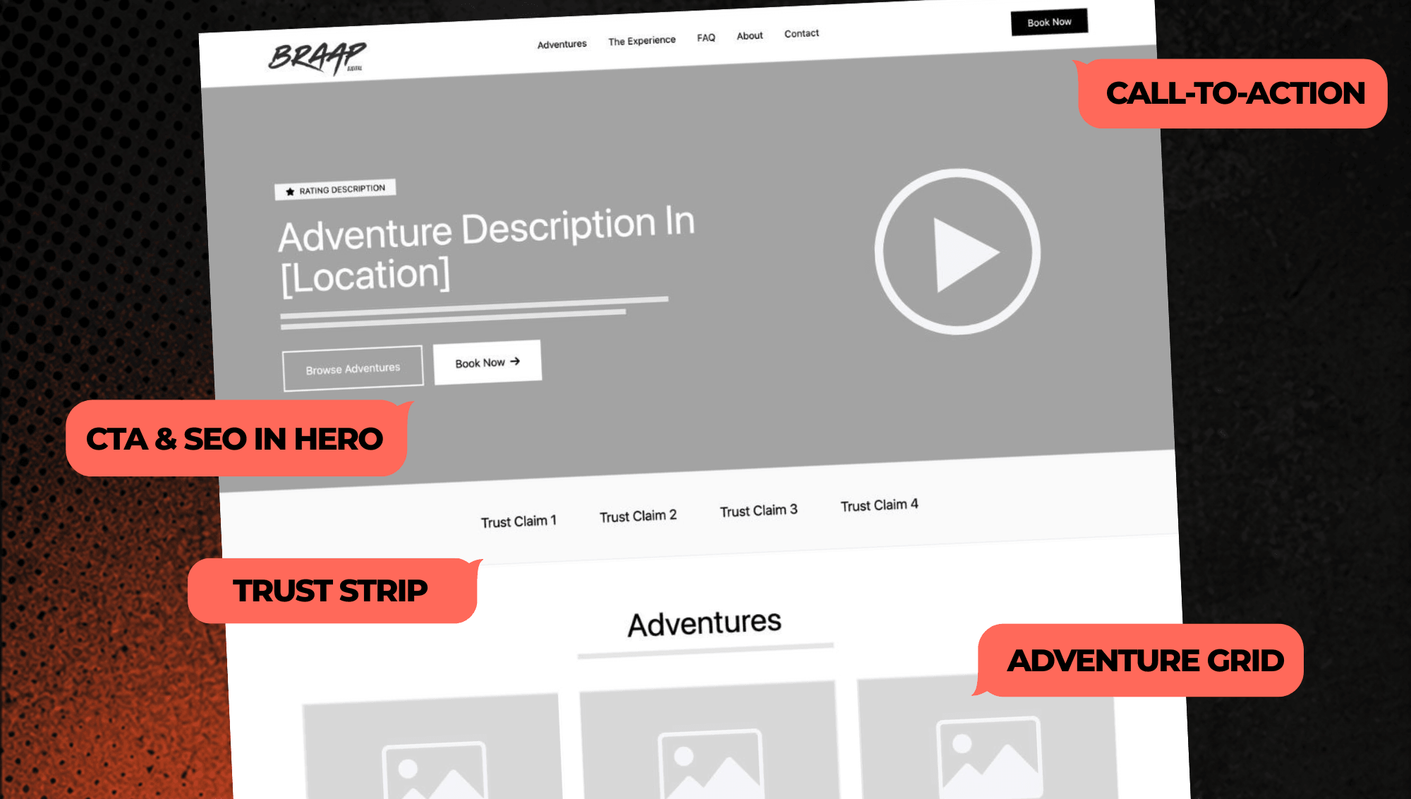
You land on the homepage and see a great image, some text, maybe a few sections to scroll through. But nothing clearly pushes you to take the next step.
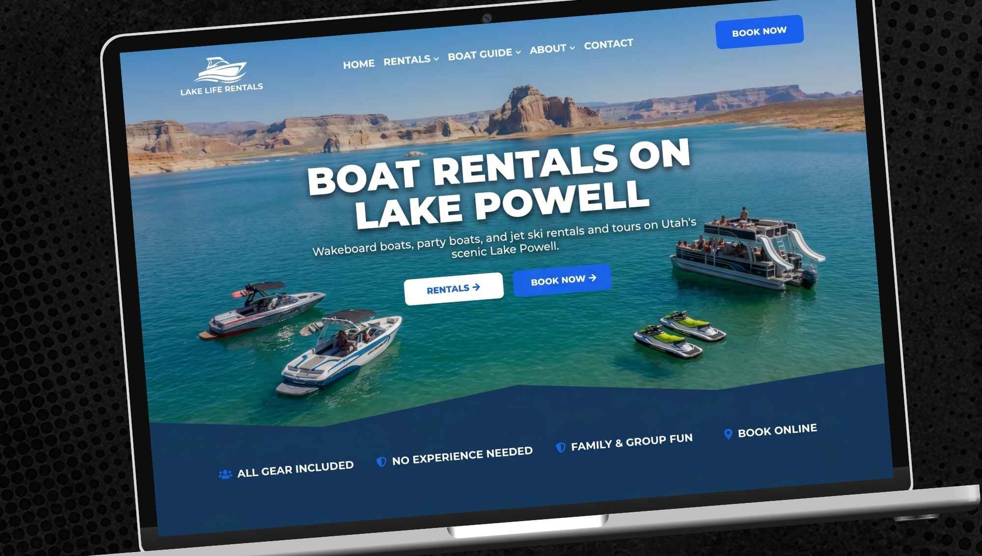
Or, there is a single “Book Now” button in the hero area, but nothing after that. Nothing after the descriptions of your adventures, nothing after the exciting videos, nothing near the bottom of the page.
Visitors generally get a feel for what you offer, but it’s not super clear about how to book.
That hesitation is where bookings get lost.
The strongest sites feel obvious. Within a few seconds, someone should be able to tell what you offer, how it works, and how to book it. Everything else supports that.
“Book Now” should always be within reach
This is one of the simplest fixes, and one of the most overlooked as we just mentioned.
Your “Book Now” button should not live in just one place. It should show up throughout the site, especially after sections that build interest.
When someone finishes looking at your rentals or tours, your photos, or your reviews, that is the moment they are most ready to act. That is where the next step needs to be right in front of them.
On mobile, this matters even more. Buttons should not disappear as someone scrolls. There should always be a clear way to move forward – on both desktop and mobile.
Where bookings usually fall apart
The biggest drop-off point is almost always the booking flow itself.
Someone clicks “Book Now” and runs into friction. Too many steps. Too many fields. Confusing layout. Surprising fees. Sometimes it is not even true booking, just a request form.
That is where people back out.
A clean booking experience feels quick and natural. Pick a time, enter a few details, and you are done.
You do not need a perfect system. You need one that gets out of the way.
Your site needs to be built for mobile first
Most of your visitors are on their phones.
After that comes desktop. Tablets make up a small percentage. That order matters.
A lot of websites are still built desktop first and then adjusted for mobile. That is usually where things start to feel clunky.
A mobile-first site is designed around how people actually use it. It is simple, fast, and easy to navigate. Booking should feel effortless.
If it is not easy and quick to book on a phone, your website is not going to convert the way it should.
Your experience pages need to do more
A lot of outfitter websites treat their tour or rental pages like basic descriptions. A few photos, a short paragraph, maybe a price. That is usually where it stops.
But this is one of the most important parts of your entire site. This is where someone decides, “Yes, this is the one” and moves forward with booking.
A strong experience page does not just list what you offer. It helps someone picture themselves doing it. It answers the questions they have before they even ask them.
When someone clicks into a tour or rental, they should walk away understanding:
- what the experience actually feels like
- who it is for
- how the day flows
- what to expect
It is not just about selling the ride. It is about setting your future customer up for success. They’ll know where to go, what to bring, and what the experience will look and feel like before they even show up.
When that clarity is there, confidence goes up. And when confidence goes up, bookings follow.
The more they understand the experience, the easier they book
A lot of hesitation does not come from price or timing. It comes from uncertainty.
People are asking themselves questions while they browse your site, even if they never say them out loud.
- What is this actually going to be like?
- Is this beginner-friendly?
- What do I need to bring?
- How long does it take?
If those questions are not answered clearly, people pause. And that pause often turns into them leaving to keep looking.
Strong FAQs and clear information sections remove that friction.
When someone can picture the experience, they feel more confident booking it.
Answer questions the moment they come up
Even with good information on the page, some people still want quick confirmation before they book.
Phone calls can handle that, but only during business hours. Live chat can help, but requires a staff member available to respond.
The gap is what happens after hours, which is when a lot of booking decisions are made.
If someone has a question and cannot get an answer, they do not always wait. They move on.
AI chat can help close that gap. Instead of waiting, customers can get instant answers to the questions that usually slow them down (and your phone gets a break from all the repetitive questions).
With their questions answered, people keep moving forward towards booking.
Social proof does more than build trust
Reviews do more than help people feel comfortable booking. They also determine whether people find you in the first place.
When someone searches “ATV rentals near me,” Google looks closely at your reviews. It considers how many you have, how recent they are, and what people are saying.
That affects where you show up in search results and whether you appear in the map pack – think “ATV rentals near me.”
The quality and amount of your Google Reviews is hands-down the single most important factor in where you rank in Google searches.
More reviews lead to more visibility for your business. More visibility leads to more traffic. And more traffic leads to more bookings.
Once someone lands on your site, those same reviews help close the deal.
Pricing should be clear from the start
Customers expect to compare options. That part is normal. What creates hesitation is uncertainty.
When pricing changes late in the process or feels unclear, trust drops. Even if the final number is fair, the experience creates doubt. You’ve probably seen this yourself.
A rental is listed at $99. That feels reasonable, so you move forward. Then during checkout it starts stacking:
- Base rate: $99
- Damage waiver: $25
- Fuel surcharge: $15
- Helmet & gloves add-on: $20
- Taxes and fees: $18
Now you are at $177.
Nothing about those fees is necessarily wrong. But the way they show up creates friction. The number changed, and it changed late – to something almost double the original price shown.
That is what causes people to pause or back out. Clear pricing keeps things moving.
When someone can see the total early, even if it is higher, they are more likely to commit because they understand what they are paying for. There is no second guessing at the final step.
You do not need to hide fees to stay competitive. In most cases, the operators who show pricing clearly win more bookings simply because the process feels more straightforward.
The part most operators don’t see: technical and on-page SEO
There is another layer to all of this that does not show up visually, but has a big impact on how many people actually find you.
Search engines are constantly scanning your site to understand what you offer, where you operate, and whether you are a good result to show.
That comes down to technical and on-page SEO.
Things like page structure, load speed, how your page and section titles are tagged, and how clearly your content communicates your services all play a role.
This is where a lot of DIY sites fall short. They might look fine, but they are not built in a way that search engines can easily understand or trust. Over time, that limits visibility.
And if people cannot find you, none of the other improvements matter.
Bottom line
More bookings come from removing hesitation at every step.
When someone lands on your site, they are looking for a quick path to a decision. The operators who win are the ones who make that decision easy.
That starts with immediate booking availability. It continues with clear pricing and a simple checkout.
It builds with strong experience pages that help people picture the ride before they ever arrive.
From there, it comes down to how well you answer questions and build confidence.
When your site educates people, shows them exactly what to expect, and gives them answers the moment they need them, the experience starts to feel real. They are no longer guessing. They are not wondering if it is right for them. They know.
That is what moves someone from browsing to booking.
That’s exactly what our BRAAP Sites were built to do: help outfitters turn website visitors into booked rides.